Hologram
...
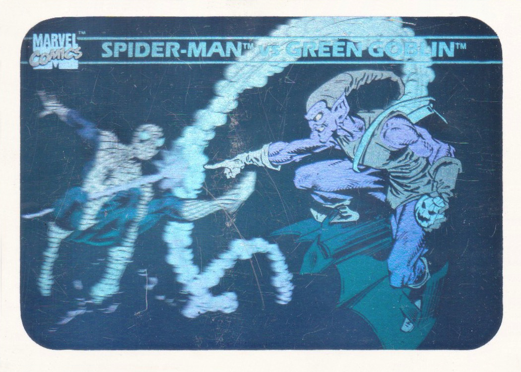
Spider-Man vs. Green Goblin
Stan Lee
(1922-2018) Stan Lee was an American comic book writer, editor, publisher, and producer. He rose through the ranks of a family-run business called Timely Publications which would later become Marvel Comics' primary creative leader for two decades, leading its expansion from a small division of a publishing house to a multimedia corporation that dominated the comics and film industries.
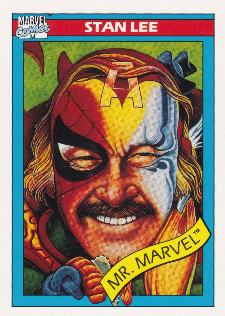
Stan Lee